
 Resources

On July 19, 2017, the Grand Council of Sigma Pi Fraternity and the Board of Trustees for the Sigma Pi Educational Foundation announced a staff sharing agreement under Executive Director Jonathan Frost (UMSL ’99), where the organizations agreed to share the services, time, and efforts of the Executive Office.
Once the agreement was established, ED Frost directed the Executive Office’s communications team to begin the process of reimagining the Fraternity and Foundation’s branding to align the two entities under one visual identity.
The team sought out many proposals from design groups with a strong knowledge and understanding of the fraternity and sorority industry, though the conversations never led to a fruitful outcome. After much deliberation between the communications team, it was determined that this was pertinent to do in-house, where the team already had the proficiency and understanding of the Fraternity’s history to handle the project and create a visual identity that paid homage to the past while moving into the future.
After much discussion, and with extensive research and historical knowledge, the project was completed, and a new visual identity for the Fraternity was born.
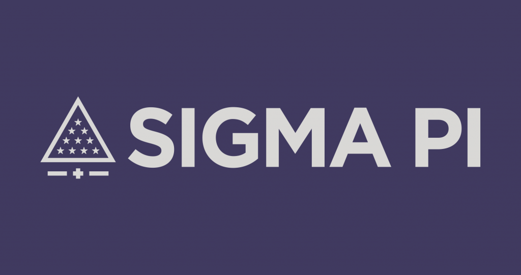
One of the most important changes lies in the new color scheme.
While the previous colors of the Fraternity served us well, a reimagined color palette was necessary. The bright purple was altered to a sleeker, darker shade that will allow for a finer contrast with the other colors within the palette. The light gray offsets the darker purple while gold serves as the auxiliary. The secondary colors are as follows: lavender, alt black, emerald, and oval blue.
The newly redesigned Sigma Pi logomark is made up of two core components: the emblem and the wordmark.
The emblem takes key elements of the organization and creates a strong statement. The primary element of the emblem is the Radiant Triangle. The Greek cross is situated below the Radiant Triangle, with a line on either side. The two lines symbolize the unity of the Fraternity and Foundation in a contemporary sense while paying homage to our founding organization Tau Phi Delta, as well as Delta Kappa, a fraternity that merged with Sigma Pi in 1964.
The main wordmark of Sigma Pi represents the strength and boldness of the Fraternity by using the Gotham typeface. The wordmark no longer includes “Fraternity, International” as a prominent element, allowing the Fraternity’s recognizable name to stand on its own. Additionally, dropping the secondary elements of the name allow this new logomark to represent both the Fraternity and the Foundation through the established shared direction for the betterment of the organization.
As Sigma Pi makes it a continued effort to facilitate better brand recognition, the logomark or wordmark with Sigma Pi spelled out will be the primary identifier used throughout marketing efforts. However, the Greek letters may be used as a secondary mark, or on apparel items specific to Sigma Pi.
Additionally, as the rebrand of the Fraternity institutes a modernization of the imagery of Sigma Pi, the Coat of Arms, or the Crest, is no exception. Just as other Greek letter organizations have done, Sigma Pi has taken a modernized and clean approach to the Crest.
While the Fraternity’s visual identity changes, the style guidelines for efficiently maintaining a standard text style have been updated. The most notable change is in reference to an individual’s chapter designation, whereas previously the brother’s graduation year was listed with their chapter designation, now, the initiate year will be listed. This alleviates the issue surrounding the lack of graduate dates for a number of brothers, as well as aligns the proper date with alumni initiates. These changes can be found as part of the Style Guidelines on page 11.
Lastly, the logo can be modified for use with the chapter or colony’s designation. Alumni clubs and provinces may also use the logo with modification of their association name. When adding a designation, the wordmark aspect of the logo will shift upward, offsetting the icon to allow space for the designation. Each chapter, colony, alumni club, and province will be provided a version of the logo custom to their group.
A “Brand Guidelines” document has been developed, and is available on the Sigma Pi website at sigmapi.org/brand. This guide has been developed to aid in the use and property recognition of the brand and visual identity of Sigma Pi.
We look forward to the future with our new brand identity as we continue on our quest for excellence.